
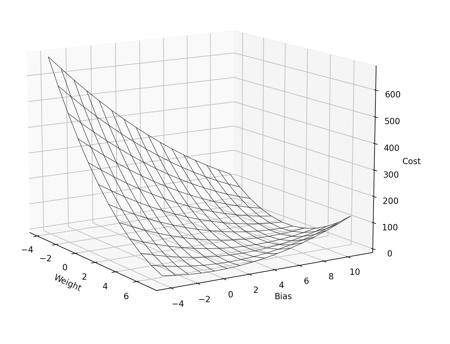
For my training "Create a neural network from scratch with Python", I needed to show a diagram that visualises the cost function.
The training data contains of a single input and single output:
training_data_input = 2
training_data_output = 14  # input * 2 + 10
As you can see, the weight should be 2 and the bias should be 10.
For this single training point, the cost needs to be calculated for a weight and bias within a certain range:
weights, biases = np.meshgrid(range(-4, 8), range(-4, 12))
Here is the cost function. It is the Mean Squared Error cost function:
(training_data_output - (w * training_data_input + b)) ** 2
The result:
Here is the code to create the diagram:
import matplotlib.pyplot as plt
import numpy as np

training_data_input = 2
training_data_output = 14  # 2 * 2 + 10

def cost(w, b):
    return (training_data_output - (w * training_data_input + b)) ** 2

fig = plt.figure()
ax = fig.add_subplot(projection='3d')
weights, biases = np.meshgrid(range(-4, 8), range(-4, 12))
costs = cost(weights, biases)
ax.plot_wireframe(weights, biases, costs, rstride=1, cstride=1, linewidth=0.5, edgecolor='black')

ax.set_xlabel('Weight')
ax.set_ylabel('Bias')
ax.set_zlabel('Cost')
plt.show()
One of the things I noticed, is that the lowest cost is not a point, but many points on a line in the diagram.
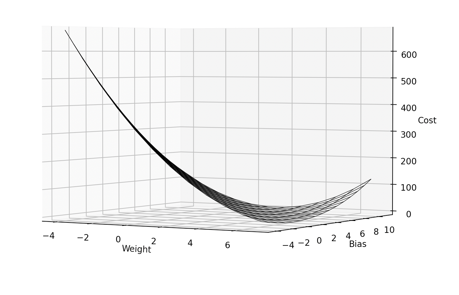
This is because many combinations of weight and bias can cause a low cost and that is one of the reasons why it is important to have a lot of training data while training a neural network!